Sunday, February 25, 2018
Wednesday, February 14, 2018
Ferdinand - Distant countryside treatment
The factories amidst the regimented Olive trees was an earlier idea, one that was supposed to show Ferdinand's transition (on his transport to the ranch) from the rounder, saturated and friendly landscape he was used to, to a de-saturated, angular threatening area where he was headed.
Started to play with cloud/smoke shapes through these as well.
Monday, February 12, 2018
Ferdinand - Int. El Primero's Bullring Prep room, Madrid.
This needed to be kept severely simple. The proportions for the props, I wanted to echo El Primero's, stretched out look. A place of meditation, almost Chapel-like. I knew the lighting would be from the one high window, and secondary lighting would be candles, etc. This had to feel like his inner-sanctum.
Ferdinand - Abattoir
The Ranch Abattoir....simple was best. Too complicated and it started looking like a factory, but it had to look menacing and different from all the other structures in the film. The first few sketches were too reminiscent of labor camps, just too dark. I thought the height of the "chimney" , the tiny windows and the barbed wire was enough.
Ferdinand-Ranch-Barn-Practice Ring-Dance Off Area
Various designs of the Ranch Barn/Practice Bullring Visitors Booth (where El Primero sat).
Horse& Bull Dance-Off area...that eventually got simplified to just grass on either side.
The original concept was that the horses were on the nicely lush, watered, grassy side, and the bulls were on the dirt and rocky "shtincky" side.
Ferdinand-Ranch Kitchen
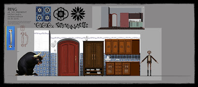
I liked mixing up the cabinets, and the curtains to give it that eclectic quality. I think the wall tiles were lost for the final.
Sunday, February 11, 2018
Ferdinand-China Shop
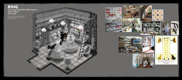
Originally the whole shop was going to be revealed wrecked, but budget contraints won out and we hear most of the carnage O/S, with just a few items and the broken front window in the film. I originally designed the front window as round, as it seemed more quaint and to match some of the other window motifs. The back door, I wanted to feel like a prison door, with the tiny window, etc.
Subscribe to:
Posts (Atom)


